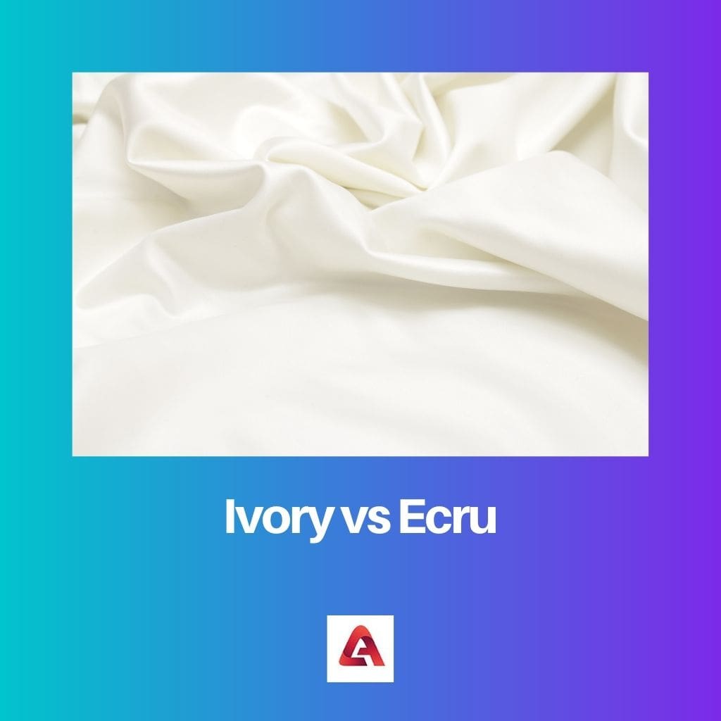
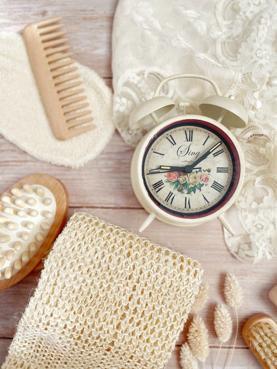
The terms ivory and ecru are two visibly distinct colours in a colour palette. Even so, there are a few shades of the above colours that do look similar.
Key Takeaways
- Ivory is a pale, creamy shade of white, associated with the color of natural ivory from elephant tusks.
- Ecru is a slightly darker, beige-like color with a more pronounced yellow or gray undertone, resembling unbleached linen.
- Ivory and ecru are popular choices for neutral color schemes and can create a warm, inviting atmosphere in interior design.
Ivory vs Ecru
Ivory is a color that resembles that of an elephant’s tusk. It is creamy white or off-white and is used at weddings. Ecru is a color that looks like a mixture of pale or slight yellow with gray and is mostly used in linen and wool, although some darker shades look like a creamy or pale white color.

Ivory is a creamy white or off-white colour that significantly resembles the ” ivory ” material (commonly found as the material that forms the hard tusks of elephants). The shade of ivory is quite similar to that of beige, and the colour, as a whole, represents a calm and peaceful nature.
The colour ecru is a pale or slightly yellow-grey mixture commonly found in colour palettes when making linen and wool. There are shades of ecru which resemble beige and are creamy white.
Comparison Table
| Parameters of Comparison | Ivory | Ecru |
|---|---|---|
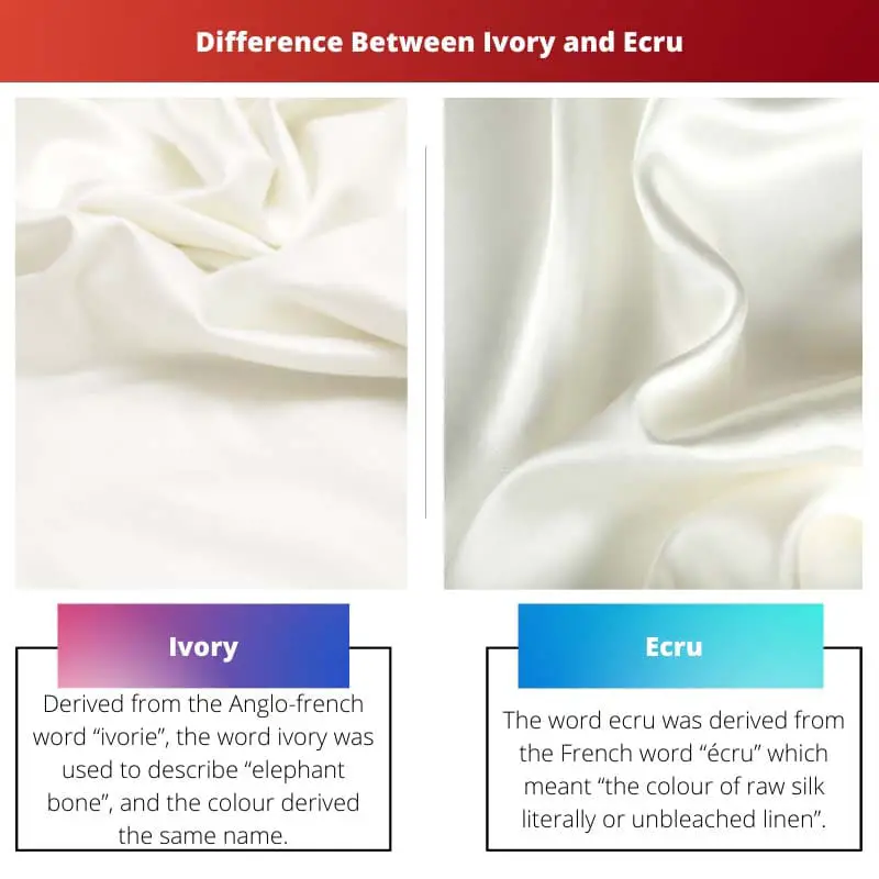
| Derivation | Derived from the Anglo-french word “ivorie”, ivory was used to describe “elephant bone”, and the colour derived from the same name. | The word ecru was derived from the French word “écru”, which meant “the colour of raw silk literally or unbleached linen”. |
| Colour | As a colour, ivory is creamy white or off-white and resembles the colour of an elephant’s tusk. | As a colour, ecru is a pale or slightly yellow-grey mixture, with a few shades resembling a creamy or pale white colour. |
| Shade of colour | As both colours look similar to beige, in comparison to ecru, ivory is a lighter shade. | In comparison to ivory, ecru is a darker shade. |
| Uses | One can notice ivory colour palettes commonly at weddings. Here, bride dresses are available in different shades and patterns of ivory. | The colour ecru is used in places such as linen or wool manufacturing. |
| Nature of colour | Ivory, as a colour, represents a quiet, collective, and pleasant nature. | Compared to ivory, Ecru represents a calm and relaxing nature with a warmer tone. |
What is Ivory?
The word ivory was derived from the Anglo-french word “ivorie”, and at the time, it was used to replace the word “elpendban”, which meant “elephant bone”. It was about the tusks of elephants.
These tusks are made of the material “ivory” and resemble the colour of ivory.
The colour ivory is a shade of white and looks creamy or off-white. It seems pretty similar to beige and can be said to be a lighter shade.
The colour ivory goes hand in hand with the colours beige and gold.
Compared to others in the beige colour palette, ivory is a lighter shade of beige but a darker shade of white. The tone of ivory makes it easier for it to be used with other lighter shades, forming elegant combinations.
The colour ivory can be used primarily in clothing lines, especially for weddings, where the bride’s dress and the bridesmaid’s dress all reflect different shades of ivory or the colour ivory itself is used.
Ivory is an elegant colour that reflects a quiet, calm, or pleasant nature. Many believe in the representation and meaning of colours and take it as a good sign when they see the ivory colour.

What is Ecru?
Ecru, as a colour, is quite similar to a darker shade of beige and is seen to be a yellow-grey mixture or a pale greyish-yellow version of beige. The term ecru originated from the French word “écru”, which meant “the colour of raw silk literally or unbleached linen”.
The name of the colour was adapted from the same.
The primary use for the colour ecru is seen mainly in the textile industry, where the manufacture of linen and wool is done. The ecru colour is dyed on all the clothing material to reflect a beautiful soothing tone.
As mentioned, ecru is a darker shade compared to others in the beige colour palette, which is why it goes great with darker shades of gold and brown.
Another plus point here is that as a colour, ecru is a derivative of yellow and brown, so it can also be used in colour combinations involving lighter tones. As a colour, ecru represents a calm, relaxing nature with a warmer tone.

Main Differences Between Ivory and Ecru
- Ivory was derived from the Anglo-french word “ivorie”, meaning “elephant bone”, while ecru was derived from the French word “écru”, which meant “the colour of raw silk literally or unbleached linen”.
- Ivory is a lighter shade when compared to ecru.
- As a colour, ivory is creamy or off-white, while ecru is yellowish-grey and pale.
- The primary use of ivory is seen in wedding colour combinations for the bride’s dress. In contrast, ecru is used mainly in manufacturing linen and wool in the textile industry.
- Ivory represents a pleasant and quiet nature, while ecru represents a relaxed and calm nature with a warmer tone.


The article’s incorporation of historical and cultural contexts adds depth and intrigue to the discussion of ivory and ecru. It’s an enlightening read for anyone interested in the symbolic significance of colors.
This information is quite useful for artists and designers who need to make informed color choices. The detailed comparison table is particularly helpful.
I appreciate the thorough exploration of ivory and ecru. The tone and nature of each color are described in a way that enhances their artistic and aesthetic value.
The article’s distinction between the nature of ivory and ecru is enlightening and brings a deeper appreciation for these colors.
Agreed, the language used to depict the colors elevates their appeal and evokes a sense of warmth and elegance.
The detailed descriptions of ivory and ecru provide valuable insights for individuals involved in interior design. Understanding the specific nature of each color is essential for creating harmonious color schemes.
The witty comparison between ivory and ecru presents a playful yet informative approach to understanding color subtleties. It’s a delightful read for color enthusiasts.
I found the playful tone of the article to be a refreshing take on color comparisons. It captures attention and sustains interest in the subject matter.
Absolutely, the lighthearted tone balances the informative content, making it an engaging read.
Thanks for the detailed comparison! I’ve always struggled to differentiate between ivory and ecru, but this article really helped me understand the distinction.
I agree, this article is an excellent resource for anyone interested in learning more about color shades and their unique characteristics.
The article’s in-depth explanation of the nature and uses of ivory and ecru is highly informative. It’s great to learn about these subtleties that distinguish similar colors.
The educational value of this article is commendable. It effectively clarifies the nuanced differences between ivory and ecru, offering a comprehensive understanding of these colors.
I find the comparison between the derivation and uses of ivory and ecru very enlightening. It sheds light on the historical and practical aspects of these colors.
Absolutely, understanding the origin and context of these colors adds depth to their significance in various industries.
The article provides a clear and concise comparison between ivory and ecru. It gives valuable information about the derivation, shade, and nature of each color.