When we talk about colours at the tertiary level or greater, we get confused as to how they look and how to differentiate between them. The prime colours like blue, green, red, yellow, and others are quite easily differentiated.
They also happen to resemble other colours, so people get confused about how to differentiate between them and other colours in the same range. There are a variety of colours in the greenish-blue shade (known as a cyan spectrum), and hence it isn’t easy to understand the difference between them.
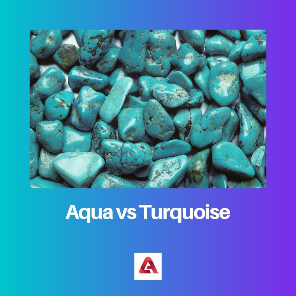
A common example of such colours includes aqua and turquoise colour. They look almost the same as each other.
Key Takeaways
- Aqua represents a blend of blue and green, with a more dominant blue hue.
- Turquoise resembles a mix of blue and green, with a stronger green influence.
- Turquoise is named after the gemstone, while aqua originates from the Latin word for water.
Aqua vs Turquoise
Turquoise is a blue-green mineral used as a gemstone. It is also a color name that resembles this mineral. Aqua is a color that is a tint of blue green, like the color of water in a tropical sea. It is also linked aquatic life and water.
Comparison Table
| Parameter of Comparison | Aqua | Turquoise |
|---|---|---|
| Origin of the name of the colour | The word Aqua is a Latin word that means water. | The colour turquoise comes from the French word “turquoise”, meaning Turkish, as it describes a gemstone from Turkey. It was a blue-green gemstone. |
| Hexadecimal code | #00FFFF is the hexadecimal code for the aqua colour. | #30D5C8 is the hexadecimal code for the turquoise colour. |
| RGB value (Red, Green, Blue) | RGB (0, 255, 255) | RGB (64, 224, 208) |
| Description | Aqua is a variation of cyan colour. It is blue with a hint of green. | Turquoise is a greenish-blue colour, i.e. it is more on the greener side than the blue side. |
| Psychology | In psychology, the aqua colour represents liveliness, trust, and rejuvenation. | In psychology, the turquoise colour represents calmness and peace of mind. It also symbolizes confidence, mental clarity, and energy. |
What is Aqua?
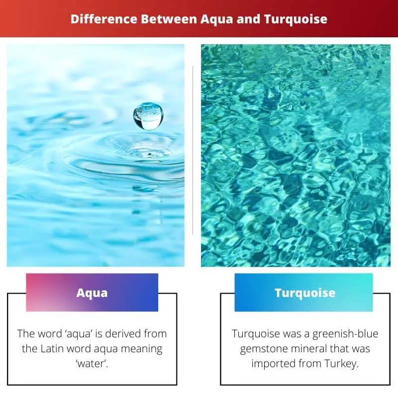
The word ‘aqua’ is derived from the Latin aqua, meaning ‘water’. Aqua is a contrast of cyan, the colour that lies between blue and green.
Cyan and aqua are two colours that look so alike that they can be used in place of one another in web design. There is no noticeable difference between them.
Like cyan, the RGB colour model of aqua is (0, 255, 255), which implies that there is 0 redd, 255 green, and 255 blue in the aqua colour. Aqua is a vibrant colour with a distinct tone that goes well with dark colours like black or grey.
It can also be combined with bright colours like yellow or orange. The hex code for aqua is #00FFFF. It is made of 0% magenta, 0% yellow, 0%black and 100% cyan.
Also, it has a lightness of 50% and a saturation of 100%. Aqua can be easily identified in the colour wheel as it is one of the most common cyan tones between blue and green.
The colours related to aqua are:
- Green
- Blue
- Cyan
Talking about psychology, liveliness, trust, and rejuvenation is what the aqua colour represents.

What is Turquoise?
Originally, turquoise was a greenish-blue gemstone mineral that was imported from Turkey. Hence it got its name from that stone, and it used to describe a shade of greenish-blue colour.
This name was first used in 1573. The turquoise colour can be used to describe the colour of seawater.
The colour turquoise has more green shade than blue shade. Turquoise also has other shades, namely, celeste and light turquoise, medium turquoise, or darker turquoise.
It is a versatile colour that can be combined with several colours, such as pink, maroon, yellow, or white. The RGB colour model of turquoise is (64, 224, 208) which means the value of red is 64, green is 224, and that blue is 208.
The hexadecimal code for turquoise is #30D5C8. Talking about psychology, calmness, and peace of mind, what the turquoise colour represents.
It also represents mental clarity, confidence, and energy. It may be considered feminine.
Main Differences Between Aqua and Turquoise
- Aqua is a contrast of cyan colour. It is bluer than green, whereas Turquoise is a greenish-blue colour, i.e. it looks more like green than blue.
- #00FFFF is the hex code for the aqua colour. #30D5C8 is the hex code for the turquoise colour.
- The RGB value of Aqua is (0, 255, 255), which means 0 red, 255 green, and 255 blue. On the other hand, the RGB value of Turquoise is (64, 224, 208) which means 64 red, 224 green, and 208 blue.
- The colour aqua comes from the Latin ‘aqua’, which means ‘water’. “Turquoise” is a French word. It describes a blue-green gemstone that was imported from Turkey. Aqua is a lively colour that can be combined with dark colours like black or grey. It can also be matched with bright colours like yellow or orange. Turquoise is versatile and can be matched with various colours like maroon, pink, yellow, or white.
- Psychologically, trust, liveliness, and rejuvenation are represented by the aqua colour. In contrast, the turquoise colour in psychology represents calmness, peace of mind, confidence, mental clarity, and energy.

So, let me get this straight. Aqua can go with bright colors like yellow but also works well with dark colors like black and gray? Guess it’s a versatile hue!
That’s right! It’s interesting how colors can affect their surrounding colors and the overall aesthetics.
I’d be impressed by anyone who can distinguish aqua from turquoise just by looking. Aren’t they basically the same?
It’s more about appreciating the subtle differences, like fine-tuning your senses to nuances in the world around us.
The devil is in the details.
I had no idea that two colors that look almost identical could have such distinct origins and psychological associations. Very informative!
It’s fascinating to delve into the history and cultural significance of seemingly common things like colors.
We’re really dissecting the color wheel here, aren’t we? I guess there’s more to colors than meets the eye!
Absolutely, it’s intriguing how colors can have such diverse symbolic meanings across different cultures.
It’s part of the beauty of human perception and interpretation.
I don’t see why people are making such a fuss about this. A color is a color. Why all this cognitive dissonance over a slight shade variation?
This isn’t cognitive dissonance. It’s about appreciating subtlety and nuance in a variety of colors.
It’s not fuss, it’s about understanding the different ways we perceive color and the cultural significance attached to them.
The color psychology seems like a lot of pseudoscience to me.
It’s a mix of cultural and marketing influence, but it’s not entirely baseless.
Psychology of color is indeed an interesting subject. The effects of colors on human emotions and behavior has been scientifically studied.
I find it hard to believe that these small variations in a color can have such deep psychological implications. Is there empirical evidence to support this?
The psychology of color is a fascinating field. There are actual studies that show how colors can have different effects on human emotions.
I’m amused that we’re analyzing color shades at this level of detail. The world is full of beautiful colors, let’s just enjoy them!
True, but understanding colors can also deepen our appreciation for them.
It’s insightful to know the cultural origins and meanings behind different colors.
I think it’s interesting to know the main differences between two similar colors and their psychological implications. Thank you!
I agree, it really makes me look at colors with a new perspective.
The color wheel might be of interest to artists and designers, but for the average person, isn’t this all a bit over the top?
It’s part of what makes art and design so rich and meaningful. Understanding color nuances can add depth to our experiences.