Table and chart are two common ways of representing the given data for a broad understanding and better analysis. These two are used in almost all fields of study and are of utmost importance for some professions.
The table is a way of presenting data in the form of rows and columns; a chart is a way of giving data in varied conditions to make it understandable.
Tables consist of rows and columns where data is presented with the help of detailed text, whereas charts use minimum data to explain the concept. Tables are the formal structures used for data analysis, whereas charts explain concepts in detail.
Key Takeaways
- A table is a data representation tool that organizes information into rows and columns, making it easy to read and compare specific data points.
- A chart visually represents data, using graphical elements like bars, lines, or pie slices to display trends, patterns, or relationships between variables.
- The main difference between tables and charts is their presentation: tables arrange data in a structured grid format, while charts use graphics to convey information more visually.
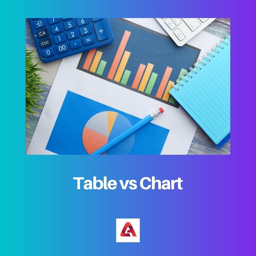
Table vs Chart
A table is a set of data presented in a structured format, which consists of rows and columns, and provides an organized way to present and compare information. A chart, is a visual representation of data that is used to show relationships or trends in the data through the use of symbols.
This should be noted that tables represent the data, whereas charts help to explain the more significant concepts and the data more efficiently.
Comparison Table
| Parameters of comparison | Table | Chart |
|---|---|---|
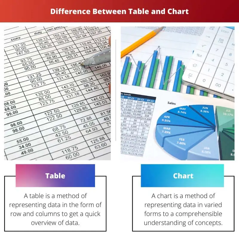
| Definition | A table represents data in rows and columns to get a quick overview of data. | A chart is a method of representing data in varied forms for a comprehensible understanding of concepts. |
| Use of symbols | A table doesn’t use symbols because it depicts the details of the data in a formal structure. | A chart makes use of different symbols, such as slices, lines, bars, etc., to depict the concepts in a better way. |
| Representation | The content is represented in the form of rows and columns. It is predominantly used to present data in numbers, quantities, names, etc. | The content is presented as pie charts, flowcharts, line charts, bars, etc., to explain the more significant concepts of the offered data. It is used to make data understandable. |
| Uses | The table is used to make data brief and quick to overview. | Charts make the given data or the concept comprehensible. |
| Types | The table doesn’t have different forms. It is a simple representation in the form of rows and columns. | Charts can be of different types, such as pie charts, bar charts, line charts, flow charts, etc. |
What is Table?
A table is a method of presenting data in the form of rows and columns. It is used as a convenience to make the data apprehensible and brief.
The detailed data can be organized in a structured form to make it quick for an overview.
While representing data in the form of table text and symbols is not of primary importance. It presents numbers, names, addresses, quantities, etc.
Some of the critical aspects of a table are as follows:
- Tables are the most common way of presenting data in various fields, such as research, experiments, formal settings, etc.
- They are used to scale the extensive data collection into an organized and structured form.
- Tables make use of rows and columns to make the details comprehensible.
- Some examples of the tables we witness daily are the periodic table of elements, table of contents, table of calculations, etc.

What is Chart?
A chart is a graphical representation of the data with the help of text and symbols to clarify the concepts. Graphs are used in various fields of study to make the data organized.
It gives a detailed analysis and a clear understanding of the data presented.
Charts are of different types such as pie charts, flowcharts, line charts, etc. Charts are used to develop a relationship with the data presented.
At times they are used to compare and contrast different things.
Some of the critical aspects of a chart are as follows:
- The chart makes use of symbols to present data.
- They are used to make the given data comprehensible by developing a relationship between the set of concepts.
- The chart provides an understanding of the given information with the help of illustrations.

Main Differences Between Table and Chart
- The table represents the data in rows and columns, whereas charts depict data in different structures.
- The table doesn’t use symbols to present data, whereas charts use characters for better understanding.
- Charts are of different types, such as pie charts, flow charts, etc., whereas the table uses the same structure of rows and columns everywhere.
- The table is used in various fields formally to provide a brief account of the extensive data collection, whereas the cart is used to explain concepts elaborately.
- The primary content used in the table is that of quantities, numbers, names, etc., whereas charts are used to develop ad represent relationships among the data.
While the differences between tables and charts are outlined effectively, the context in which each method is used could be better emphasized to provide a richer understanding of their applications.
The technical aspects of tables and charts are presented logically. Readers with a background in data analysis will find this article particularly insightful.
The juxtaposition of tables and charts is well-illustrated, making it easier for readers to discern the varied applications of each method. A great guide for those looking to understand data representation.
It seems like the article focuses on the technical details of tables and charts. For readers looking for an in-depth understanding of data representation, this is an informative read.
While the article provides a detailed analysis of tables and charts, the explanations could be more engaging and less formal. More relatable examples would enhance the content.
The contrast between tables and charts is well-explained. It’s evident that both are used for different purposes, and their applications are varied across different fields. Great article!
This article provides a comprehensive overview of the differences between tables and charts. The information given clearly highlights the importance of both in representing data.
The breakdown of ‘What is Table?’ and ‘What is Chart?’ is particularly helpful for readers new to the topic. The definitions are clear and easy to comprehend.
The detailed description of tables and charts is enlightening. It’s clear that tables focus on organizing data, while charts emphasize visual representation for better understanding.
The comparison table is an excellent addition to the article. It neatly summarizes the differences between tables and charts, making it easier for readers to grasp the key points.