To represent data in a more organized and structural manner, graphs have been proven to be the best option. It has edges and vertices connecting them.
And the visual representations of it are known as charts.
It is used in various subjects, including maths, physics, chemistry, etc. Graphs and charts have types that are used according to the data that has to be represented.
These types include Histograms and Bar-graph. Both of them have different characteristics that are important to understand for using them.
Key Takeaways
- Bar charts display categorical data, with bars representing distinct categories.
- Histograms represent continuous numerical data, with bars illustrating frequency distribution across intervals.
- Bar charts have gaps between bars, while histograms have continuous bars reflecting the continuous nature of the data.
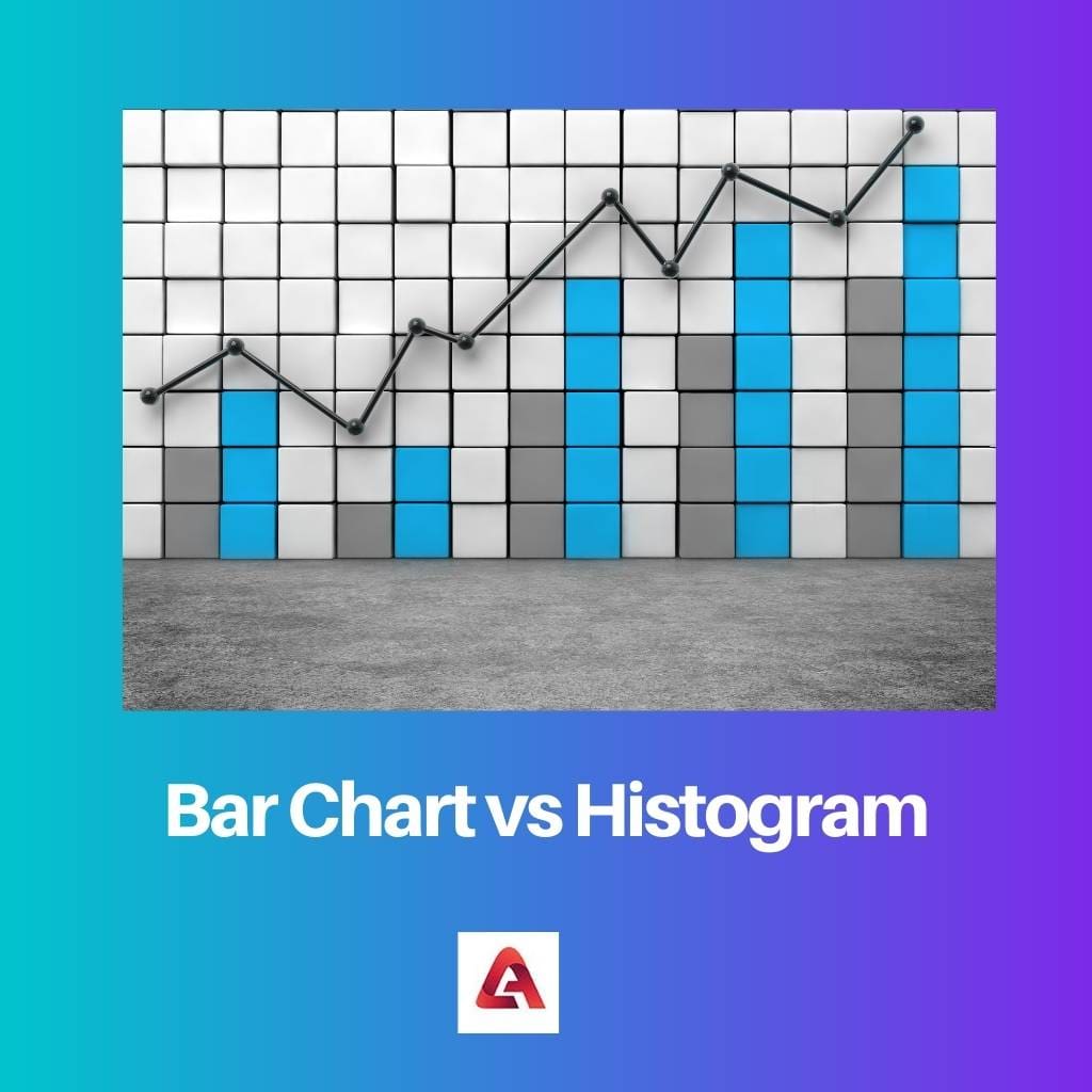
Bar Chart vs Histogram
Bar Charts represent categorical data by the bars in a bar chart, whereas a Histogram represents a graphical depiction of the quantitative data sets grouped under a certain parameter. The bars in a bar chart do not touch each other, while the bars in a histogram touch each other.
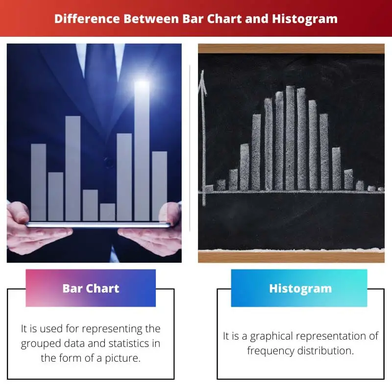
A Bar Chart is used to represent the data in pictorial form. It represents the grouped data in a rectangular shape. It is also called a bar graph.
It is the basic form of pictorial representation of data used in statistics. It is a one-dimensional representation. It also has several types and categories.
The histogram represents the continuous class of grouped frequency distribution in graphs.
It has rectangles that are adjacent and proportional to the frequency of a variable and have the same width as the class intervals. It is a two-dimensional representation.
It is the most used for frequency distribution. There are several types of histogram graphs that are used based on preference mostly.
Comparison Table
| Parameters of Comparison | Bar Chart | Histogram |
|---|---|---|
| Variables | Comparison of discrete variables. | Distribution of non-discrete variables. |
| Bars | Does not touch each other | Touch each other |
| Width | Mostly equal | May vary. |
| Dimensions | One dimensional | Two dimensional |
| Types of data | Categorical data. | Numerical data. |
What is Bar Chart?
It is used for representing the grouped data and statistics in the form of a picture (rectangles). Following are the properties of a bar graph.
- All rectangles have a common base, and these rectangles are called bars.
- Columns of each should have equal width.
- The height of the bars represents the value.
- Distance between bars or rectangles should be equal.
Advantages of Bar Chart:
- Summarises the large data.
- Frequency distribution is displayed with each class.
- Clarifies it better than in tabular form.
- Helpful in estimating the key values.
Disadvantages of Bar Chart:
- It may not reveal the pattern and cause, etc.
- It can be easily manipulated.
Types of Bar Charts:
- Vertical Bar Graphs: bars are represented in a vertical form where bars are used for representing the measure of data. The bars are represented on the y-axis, and their height represents the values.
- Horizontal Bar Graphs: when the bars are drawn horizontally on the x-axis, they show the measures of data, and the length of them represents the values of data.
- Grouped Bar Graphs: they are called cluster bar graphs. It is used for representing more than one object of the same categories with discrete values. In this, different sets of items are compared.
- Stacked Bar Graphs: also known as composite bar graphs, in this each bar can be described with different colors to make t easy for comparison, bars of this bar represent different groups.
What is Histogram?
It is a graphical representation of frequency distribution. The following are the steps required for constructing a histogram:
- Mark the X-axis and Y-axis by class intervals and frequencies, respectively.
- The scale should be the same for both axes’.
- Class intervals should be exclusive.
- Draw rectangles as per the data.
Use of histogram can be done under the following circumstances:
- Data is organized in numerical.
- To check the shape of data distribution.
- In the case of two or more processes for checking, the output is different.
- To check whether the process is meeting the customer’s requirements.
Following are the types of the histogram:
- Uniform Histogram: it reversals that the number of classes is extra small. And in this, each class has the same number of elements. It may or may not have a distribution with several peaks.
- Bimodal Histogram: bimodal histogram has two peaks. It is used for data that has two different kinds of individuals or groups.
- Symmetric Histogram: it has the same shape on both sides of the middle. It is perfectly symmetric, which means it is cut in half. Both of the halves will look like a mirror image. Those that are not symmetric are called skewed.
- Probability Histogram: it is used for showing the pictorial representation of discrete probability distribution. It is begun by selecting the classes.
Main Differences Between Bar Chart and Histogram
- Both histogram and bar chart is used for pictorial representation of the different types of data, and the bar chart is used for comparing the discrete variable while the histogram is used for the representation of the distribution of a non-discrete variable.
- Both types have rectangular-shaped bars, but in the bar chart, the bars do not touch each other, whereas, in the histogram, each bar connects or always touches each other, leaving no space in between.
- In the histogram, elements are grouped to make them considered ranges, but this is not the same in the bar chart. Elements are taken as individuals only.
- The width of the bar chart is almost the same, whereas, in Histogram, the width may or may not vary.
- A bar chart is used for comparing the different data of different categories, whereas a histogram is used for displaying the occurred frequencies.
- The rearranging of blocks cannot be done in histograms, while it can be done in bar charts.