As a fan of American comic books, you are undoubtedly familiar with Batman, one of the most iconic superheroes in the DC Comics universe. This legendary character first appeared in Detective Comics in 1939 and has captivated audiences ever since, gaining worldwide recognition and prominence.
In this article, you will delve deeper into the rich history of Batman, exploring its origins and the evolution of the renowned Batman logo. Understanding these aspects will provide a greater appreciation for the legacy of the Caped Crusader and his impact on popular culture.
Meaning and History
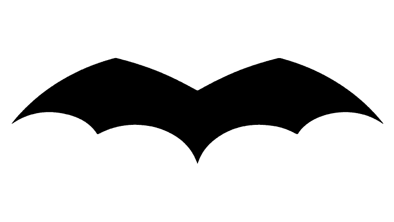
You may have noticed the iconic Batman logo primarily features a black silhouette of a bat. Since 1940, the logo has seen about 30 modifications, showcasing an array of fascinating wing shapes throughout the years.
The most recent design iteration comes from Cathryn Laver (also known as Calm the Ham), who drew inspiration from various comic book sources and a YouTube video that showcased the logo’s evolution. The Batman logo’s vivid and ever-changing history reflects the character’s immense popularity and enduring legacy in pop culture.
Emblem Evolution in the Comics
1939
The initial Batman emblem from 1939 was minimalistic, consisting solely of wings with no head or ears. This version featured five wing points, which would change over time. The emblem occupied only a small space on Batman’s chest.
1939 – 1941
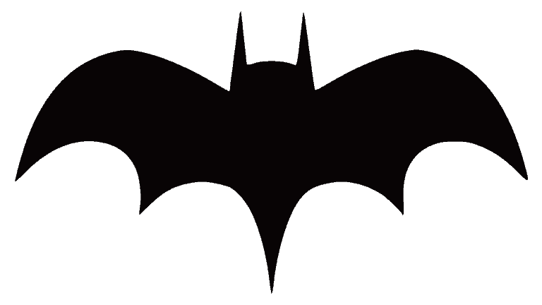
During this period, the emblem was modified to include sharp ears and a head. The rounded wing edges became sharper, and the number of bottom wing points varied between five and seven.

1941 – 1944
The emblem adopted a more gothic appearance, featuring long, sharp wing points. The head became less visible while the angles on the top of the wings grew more distinct.

1944 – 1946
This version appeared wider than previous emblems, with exaggerated bottom and top wing points that were shorter. The tail became shorter, and the ears more prominent.

1946 – 1950
The emblem during this time returned to the original design, with a longer and sharper central wing point. The other wing points became slightly less angular, and the head grew larger and more noticeable.

1950 – 1956
From 1947 to 1950, the top wing points became more rounded, creating a smoother curve. This design allowed the emblem to occupy more space on Batman’s chest.
1956 – 1958
During this period, the emblem maintained its rounded top wing points. The emblem continued to occupy a more significant portion of Batman’s chest. The head remained visible, while the bottom wing points grew more angular.

Symbol Evolution in the Movies
1943
In 1943, the superhero appeared on TV in a live-action series called Batman, starring Lewis Gilbert Wilson. The emblem in this adaptation was small, similar to the comics of that time. However, this version had more wing details, featuring a thin and wide bat image.
1949
While creating the 1949 serial “Batman & Robin,” costume designers used the 1943 version with wing detailing as their primary inspiration. The bat became larger, and the shape of its head changed.
1966 – 1968; 2016 – 2017
The television series that premiered in 1966, starring Adam West, showcased a different icon heavily influenced by the comics of that era. A notable change in this Batman logo is the addition of a yellow oval. The wings were close to the ellipse shape but hadn’t yet spread to the oval border.
1967
In 1967, the Batman emblem temporarily featured a black silhouette of a man holding scales (symbolizing justice). This symbol was used in the movie ‘Batman vs. Dracula.’
1977
The new logo, used in ‘The New Adventures of Batman,’ boasted a small-headed bat with long claws and extended joints.
1989
In the 1989 movie Batman, starring Michael Keaton, the logo had a large bat inside a yellow oval with a thick black outline. Interestingly, the movie poster featured the bat with five wing points along the bottom, while the bat had seven points in the film. This design was different from the comic version during that time.
1992
The movie “Batman Returns” logo was updated and was now much closer to the iconic elliptical symbol, displaying an extended tail.
1992 – 1995; 1998
In this period, encompassing “Batman: The Animated Series” and “The New Batman Adventures,” the emblem underwent another change. The bat had six points on the bottom and was easier to identify in the ellipse.
Symbol
The Batman logo represents the vigilante persona of Bruce Wayne, who experienced a tragic childhood event that pushed him to seek justice and fight against criminals. The symbol embodies the determination to confront evil, the pursuit of fairness, and the resilience to grow stronger in adversity.
With its dark and imposing bat silhouette, the logo symbolizes the inner strength and hope that Bruce Wayne draws from his experiences and convictions. It also emphasizes the importance of striving for purity and uprightness, as Batman remains incorruptible in the face of temptations and challenges. This emblem serves as a guiding force, leading you through adversity and hardships toward a brighter future.
Icon
The Batman icon has evolved, with various designs representing the iconic superhero. One of the most recognizable versions features a yellow and black horizontally stretched oval showcasing the bat symbol.
Recently, a more simplistic and geometric design has been adopted, displaying a sharp black bat silhouette against a white background or a white bat on a black square with rounded edges.
A lighthearted caricature of Batman’s face wearing the mask also exists, offering a whimsical take on the superhero. However, this depiction is not utilized in official capacities. With these diverse designs, the Batman icon continues to symbolize the spirit of the renowned character.
Font
The original Batman logo emerged in the late 1930s, showcasing a simple yet elegant bat silhouette boasting widespread wings against a plain backdrop. The bat design excluded the head and displayed rounded wings with five-pointed features at the bottom.
It wasn’t until 1964 that the Batman emblem incorporated the now-famous yellow oval, drastically enhancing the badge’s power and uniqueness. Interestingly, Batman justified the yellow oval as an attention-grabber, diverting enemies’ aim toward the emblem’s center, where bulletproof protection lies.
Please note that the Batman logo is copyrighted and belongs to DC Comics. If you intend to use the iconic black bat on a yellow background, obtaining permission from the copyright holder is necessary.
Since its inception in 1939, the Batman logo has undergone over a dozen redesigns. The yellow oval variant, leading in popularity, was crafted in 1964 and later refined in 1967. This version remained a franchise staple until 2000, with the current iteration introduced in 2018.
